Ensemble empirical mode decomposition in Excel
This tutorial shows you how to decompose a time series using the empirical mode decomposition (EMD) and its noise-assisted version, the EEMD, in Excel using the XLSTAT statistical software.
Dataset for EMD / EEMD
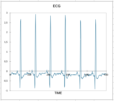
The dataset used to illustrate the ensemble empirical mode decomposition is an example of electrocardiogram data from the MIT-BIH Normal Sinus Rhythm database. It consists of the first 700 observations, which were recorded with a sampling interval of 0.0078125 seconds.
This tutorial aims to decompose this complex signal into a finite and relatively small number of components, also known as IMFs, for intrinsic mode functions.
How to set up an EEMD or an EMD with XLSTAT?
-
Open XLSTAT
-
Select the XLSTAT / Advanced features / Time series analysis / Time series transformation menu. The Time Series Transformation dialog box will appear.
-
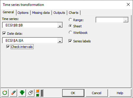
In the General tab, select the values of the time series and the date data
-
Check the Check intervals option to make sure there is no gap in the data
-
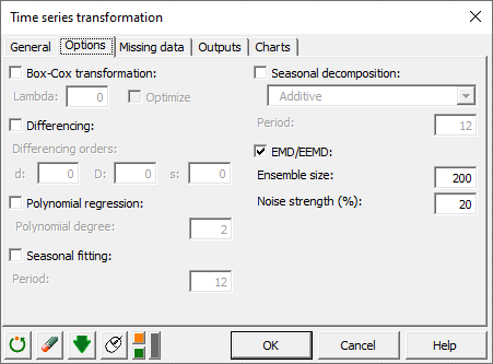
In the Options tab, check the EMD / EEMD option
-
Enter the ensemble size to use for the EEMD (200 in our example). To run a regular empirical mode decomposition set the ensemble size to 1
-
Enter the noise strength as a percentage that is relative to the standard deviation of the original time series. A 20% noise strength is common when running an ensemble empirical mode decomposition. To run a regular EMD set the noise strength to 0%.
How to interpret the results of an empirical ensemble mode decomposition?
The following table is the main output of the EEMD. It contains the extracted intrinsic mode functions, which all yield frequency information, that can be analyzed using Hilbert spectrums. This decomposition method can also be used to denoise signals, or detect anomalies when the IMFs are used as inputs in complicated models.
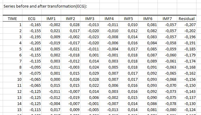
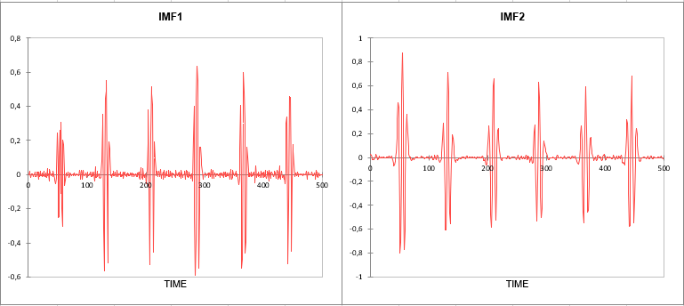
Eight intrinsic mode functions, including the residual, were extracted from the EEMD. The following charts correspond to the first two components of the decomposition and represent those that yield the highest frequencies.
Was this article useful?
- Yes
- No
